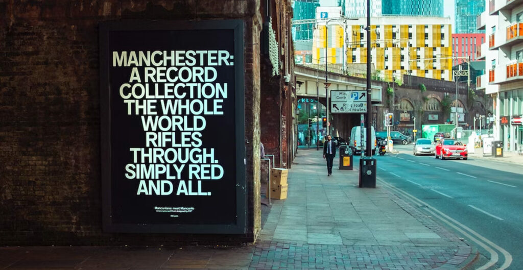
Some campaigns shout. This one speaks in pure Manc.
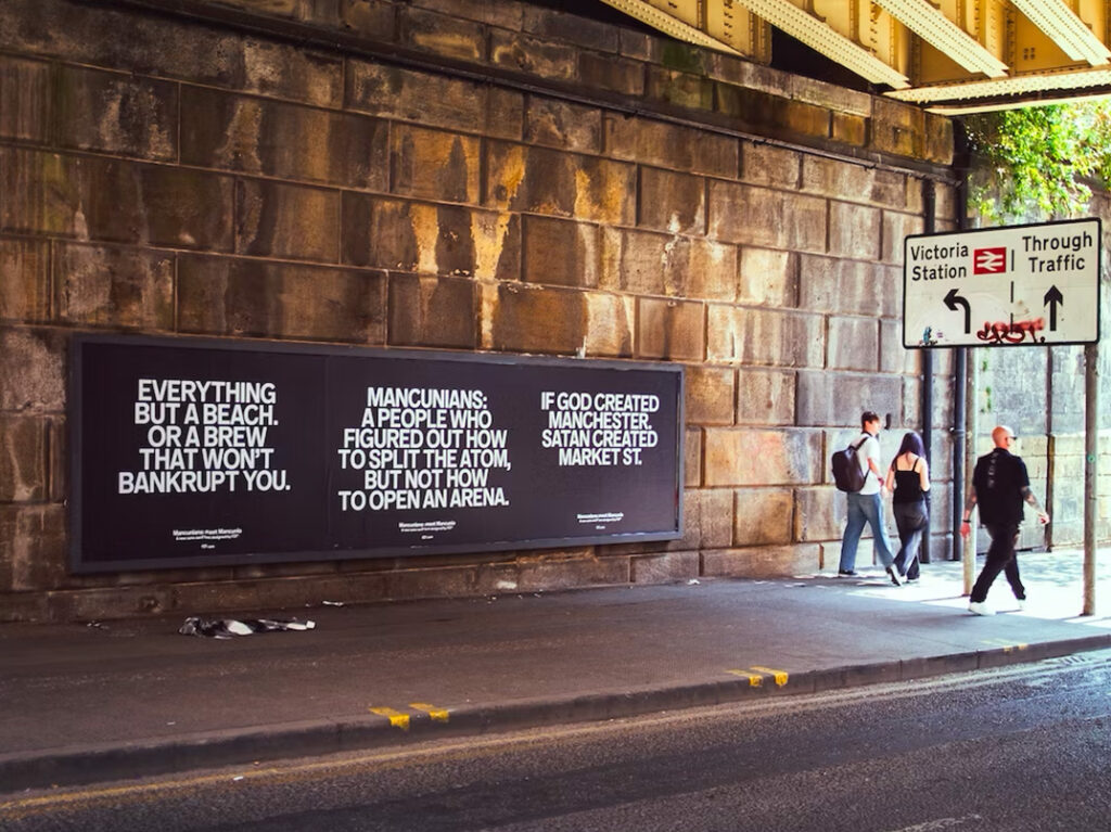
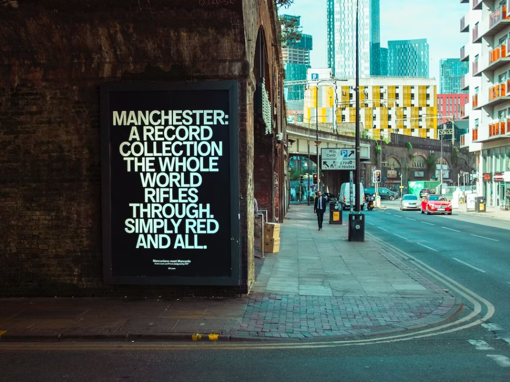
To mark the launch of Mancunio, a new sans-serif typeface rooted in Manchester’s heritage, F37 Foundry took their message to the streets, literally. In a bold, black-and-white billboard takeover, six typographic moments appeared across the city, capturing the wit, charm and quiet pride of its people.
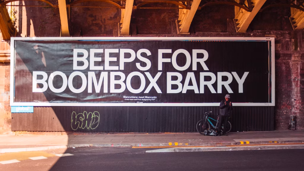
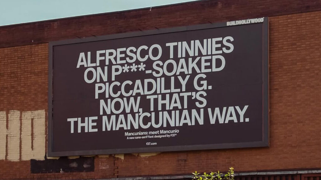
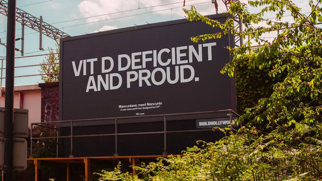
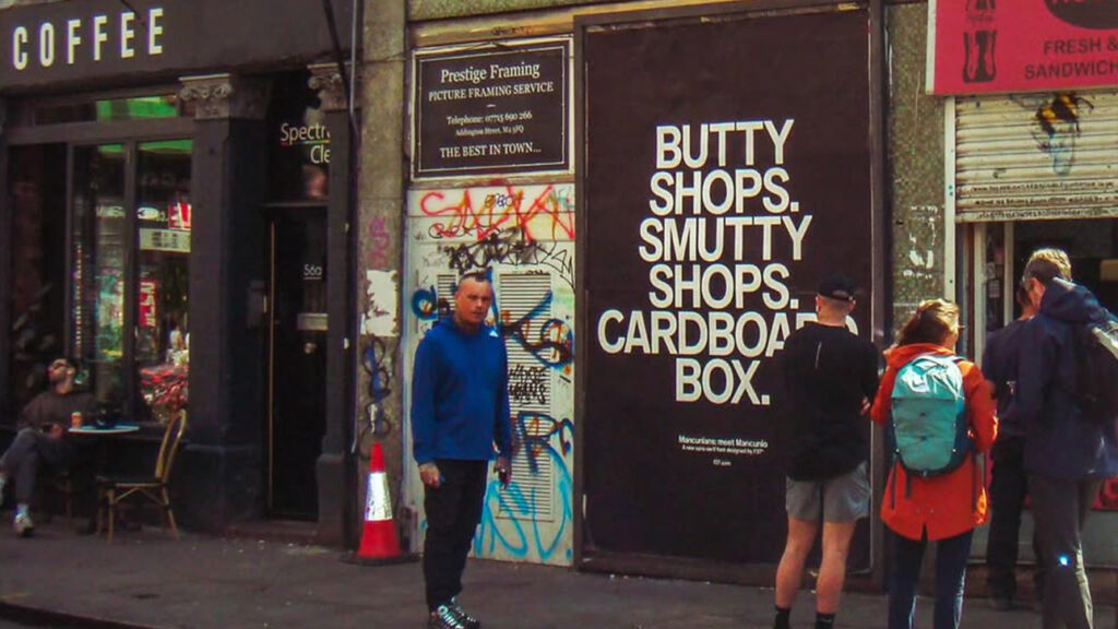
Crafted by Ellen Ling and designed in partnership with Craig Oldham’s Office Of Craig, the work is a love letter to Manchester that avoids the usual tropes. Gone are the references to Hacienda-era nostalgia. In their place? Local in-jokes. Community quirks. And a visual tone that echoes the city’s last remaining wooden street sign.
At a time when cities are often used as blank canvases for global brands, this one feels personal. Hyper-local. Honest. And all the stronger for it.
Mancunio isn’t just a typeface, it’s a type of place.