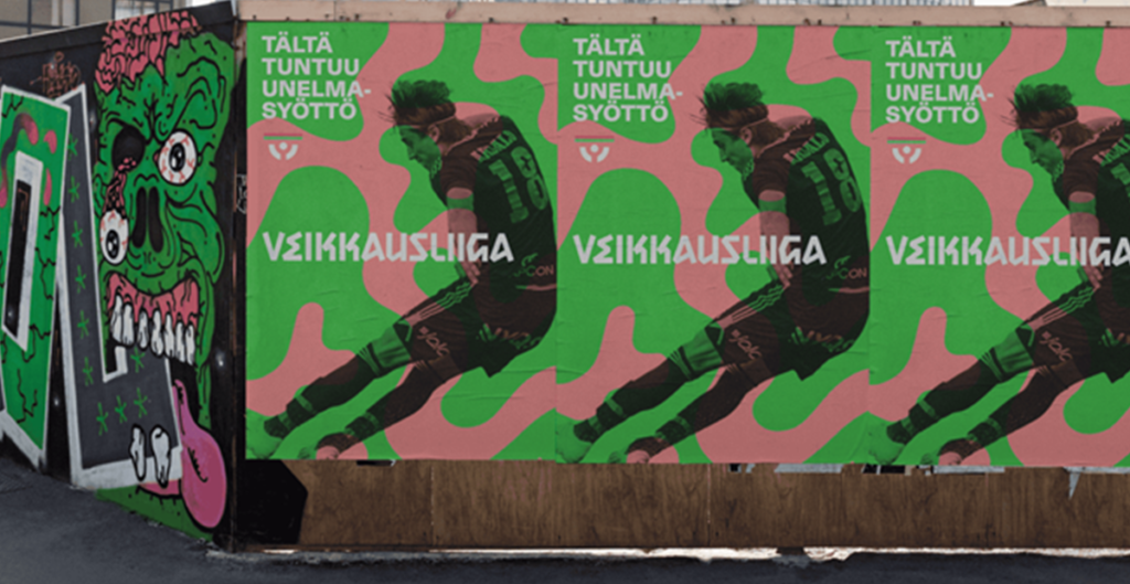
Most leagues talk about fans. Finland’s top football league just built a whole brand identity around them.

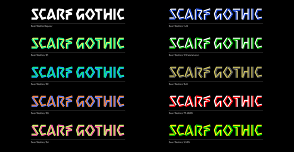
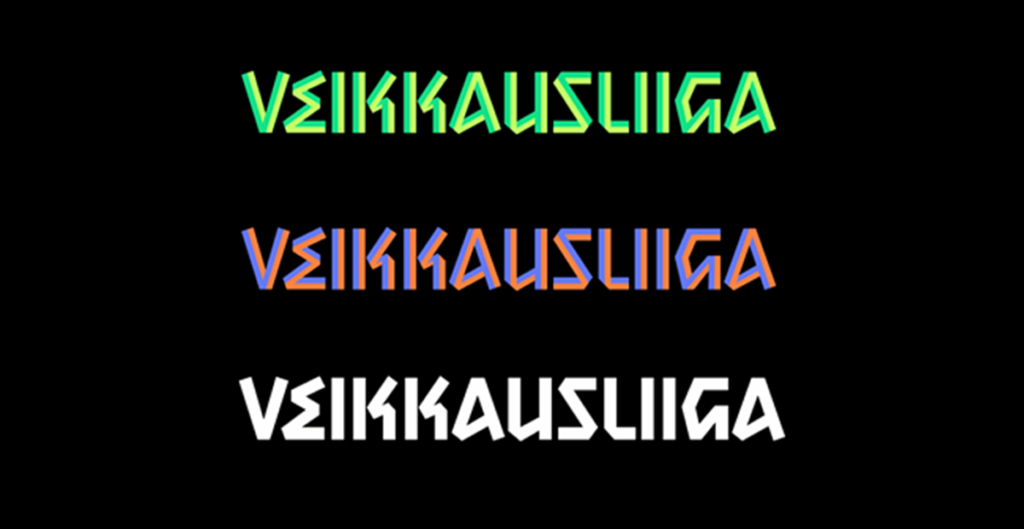
In a bold rebrand led by creative agency Bond, Veikkausliiga has launched a visual system that doesn’t just nod to supporter culture — it’s crafted from it. The centrepiece? A bespoke typeface called Scarf Gothic, born from the very thing that unites stadiums across the country: football scarves.
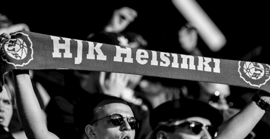
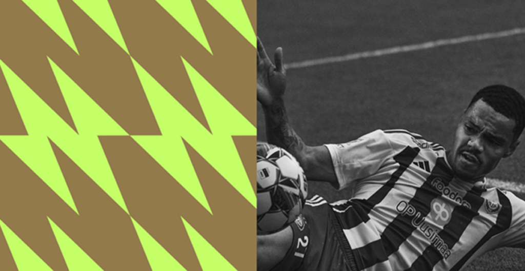
Sharp, angular, and unapologetically bold, the typography is shaped by scarves laid flat, their geometry baked into every letterform. Each club gets its own variation, tying in colours and character — a tactile reminder that every fanbase has its own voice.
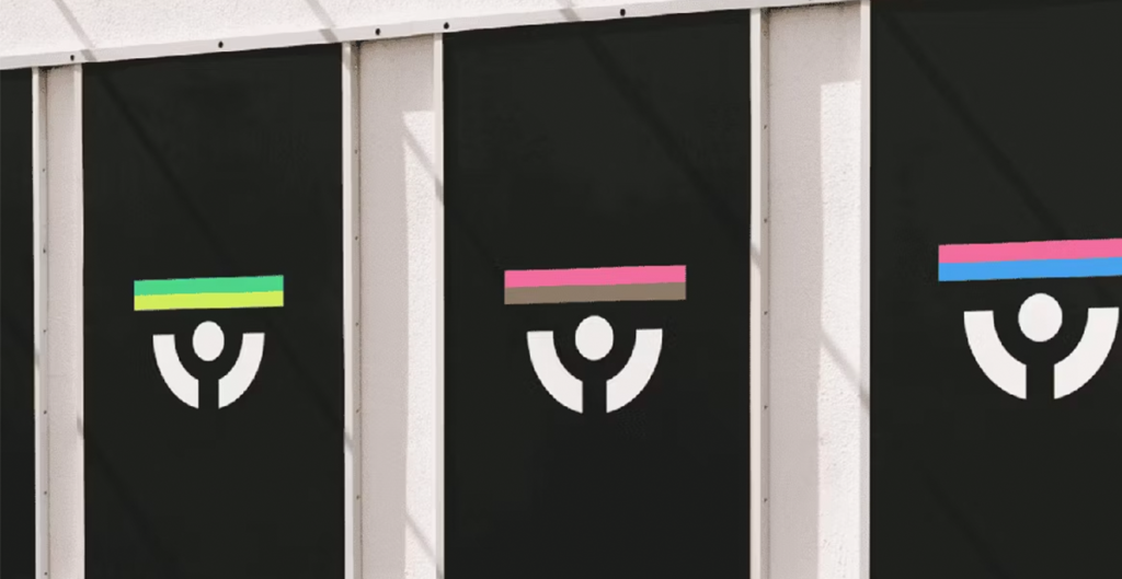
But it’s not just type that’s telling the story. The logo, too, has evolved. A simple, modern reinterpretation of a supporter raising a scarf, now stripped back to bars, arcs and circles, abstract, but instantly understood.
Launched on the back of Finland’s historic run at the Euros and Pukki’s high-profile homecoming, this isn’t just a rebrand.
It’s a rally cry.
Insight:
This work proves what many overlook, true identity doesn’t come from the boardroom, it comes from the stands. When you build your brand from the culture up, not the top down, people feel it.