Here’s a design challenge for you: How do you make people care about something they never think about until it hurts?
Welcome to the world of insoles, a $3.5 billion industry that’s historically operated in the shadows of athletic retail. It’s the ultimate “invisible product” category: essential but ignored, functional but forgotten.
Until now.
Superfeet just dropped a brand transformation that turns “Performance Amplified” from corporate speak into visual electricity, proving that even the most overlooked categories can command attention with the right design strategy.

MLTI NYC’s creative director Kristen Shenk nailed the brief: “We made the unseen seen. It’s about revealing the hidden tech that gives you the edge.”
The strategic insight? Stop hiding from being functional. Celebrate it.
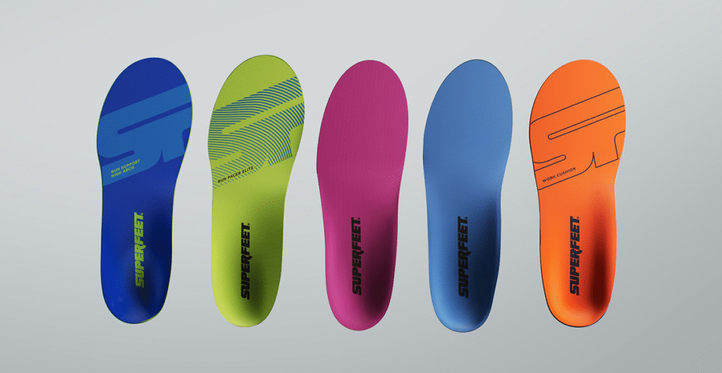
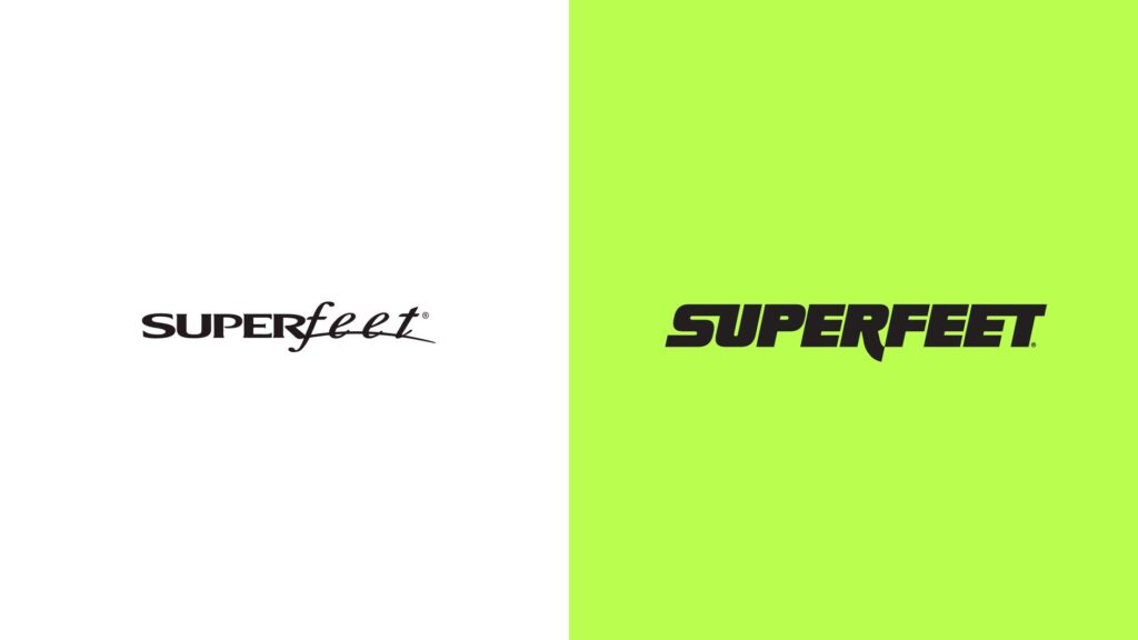
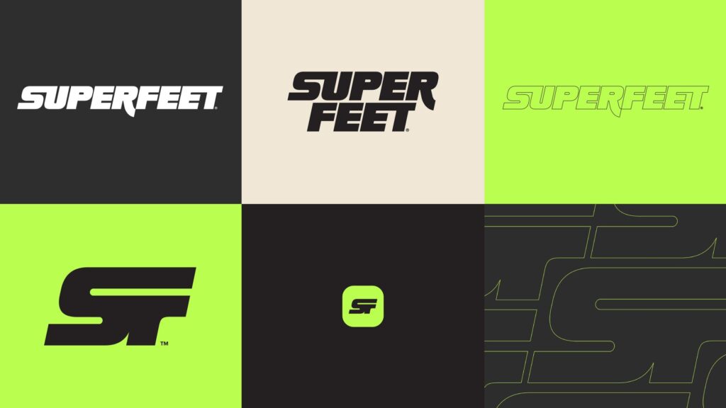
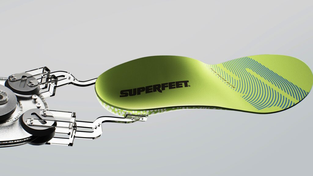
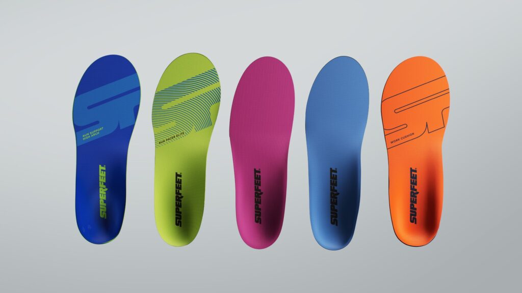
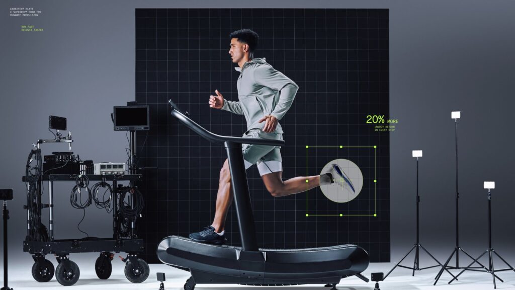
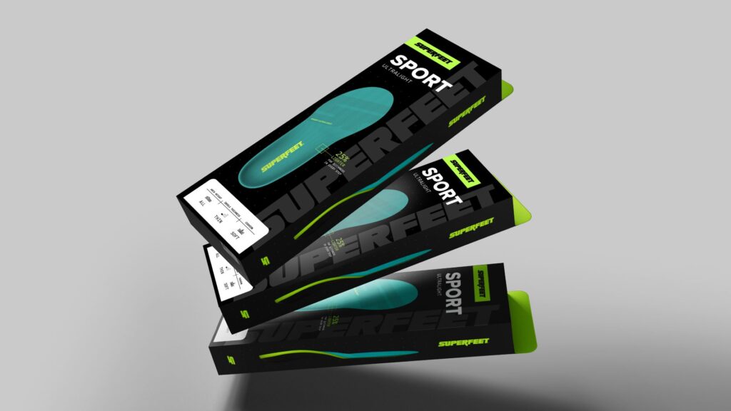
Most brands in “boring” categories try to sexy themselves up with lifestyle imagery and aspirational messaging. Superfeet went the opposite direction, they weaponised their technical heritage. That signature “Super Green” neon? It’s lifted straight from their best-selling product, now turned brand signature.
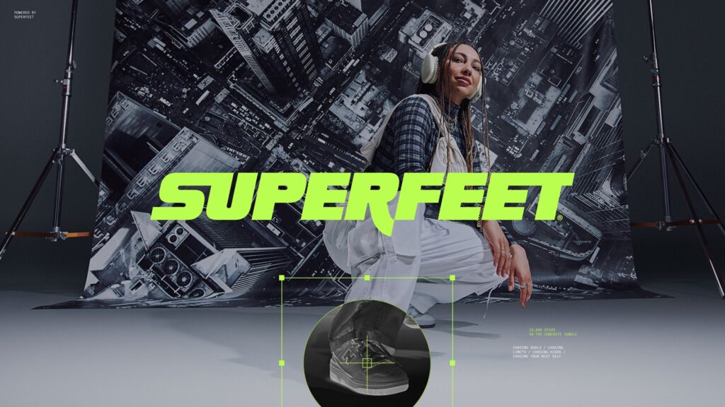
Here’s what’s brilliant about this rebrand: It doesn’t just serve elite athletes. The “Powered by Superfeet” platform is designed for collaboration and built to elevate real athlete stories, not just the ones with endorsement deals.
The brand strategy lesson: In a world obsessed with exclusivity, accessibility can be your differentiator. Every foot deserves performance, not just the ones that make highlights reels.
Breaking the Beige Barrier.
Let’s talk about the elephant in the sporting goods aisle: Most performance gear either looks like it was designed by committees who’ve never broken a sweat. Blacks, greys, the occasional navy blue or a copy and paste job of the nearest competitor having a moment. Safe. Boring. Forgettable.
Superfeet’s neon green signature colour doesn’t whisper, it shouts. It says, “Yes, we’re the thing you put inside your shoe, and we’re proud of it.”
The design courage here? They made the invisible impossible to ignore.
The Motion Advantage.
Their 70-second hero film doesn’t just show products, it captures energy in motion, charting the journey of athletes across training days and race days.
Smart move. Static brands feel static. Motion suggests momentum. When your category is literally about movement, your brand better move too.
The Bigger Brand Truth.
Superfeet’s transformation reveals something crucial about modern brand design: The “unsexy” categories often offer the biggest opportunities. While everyone’s fighting over the sexy real estate, there’s virgin territory in the overlooked corners.
The strategic question every brand should ask: What are we hiding that we should be celebrating?
Design lessons for the brave:
1. Embrace your unsexy: Don’t apologise for what you do. Amplify it. The world needs fewer brands trying to be something they’re not.
2. Make the functional magnetic: Technical doesn’t mean boring. It means you have stories others can’t tell.
3. Colour is courage: If your brand palette could be described as “professional,” you’re probably playing it too safe.
4. Motion beats pretty: Beautiful static design often gets forgotten. Kinetic energy gets remembered.
The question isn’t whether your category needs a design revolution. It’s whether you’re brave enough to lead it.