Most football rebrands either fall into cliché or chase fleeting trends. Stripped-back sans-serifs, over-designed badges, lifestyle crossovers that feel forced. In the process, clubs risk eroding what makes them culturally magnetic: heritage that feels alive, not archived.
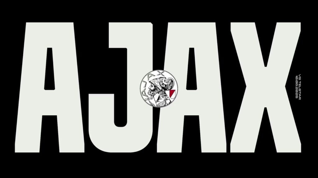
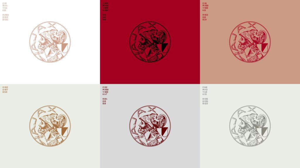
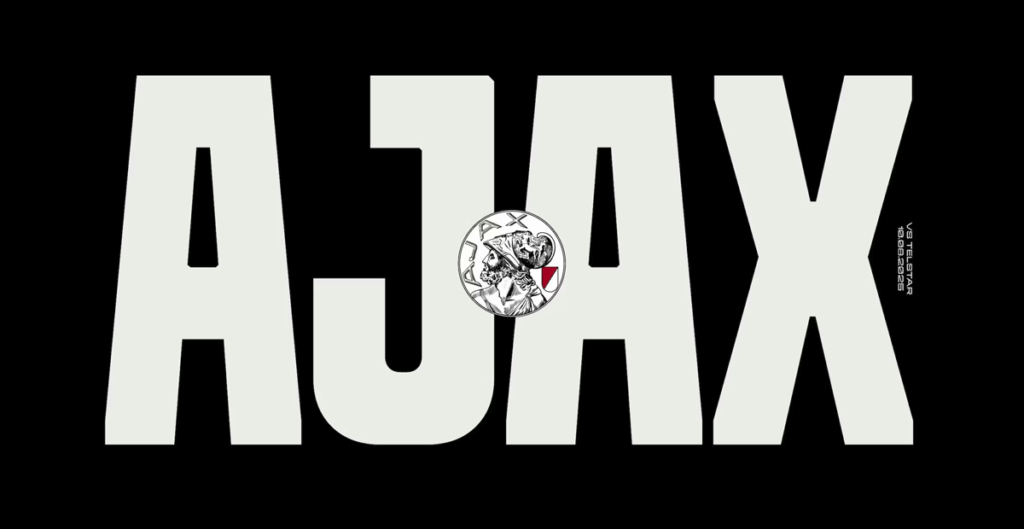
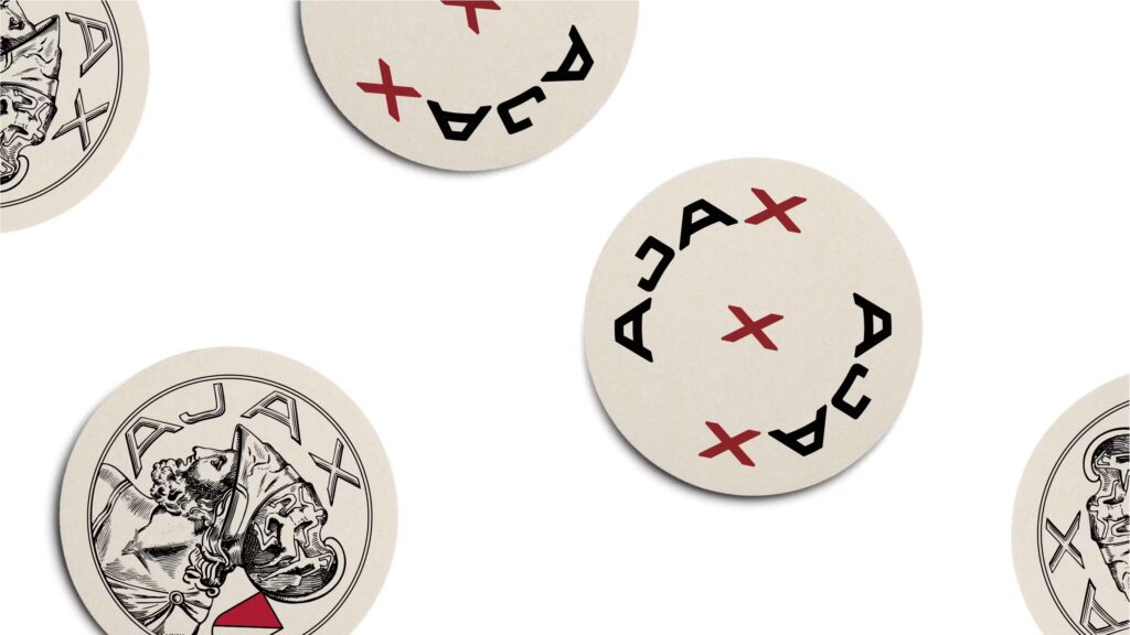
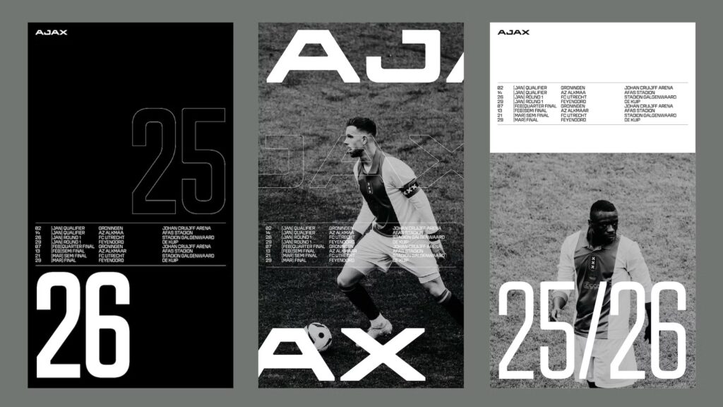
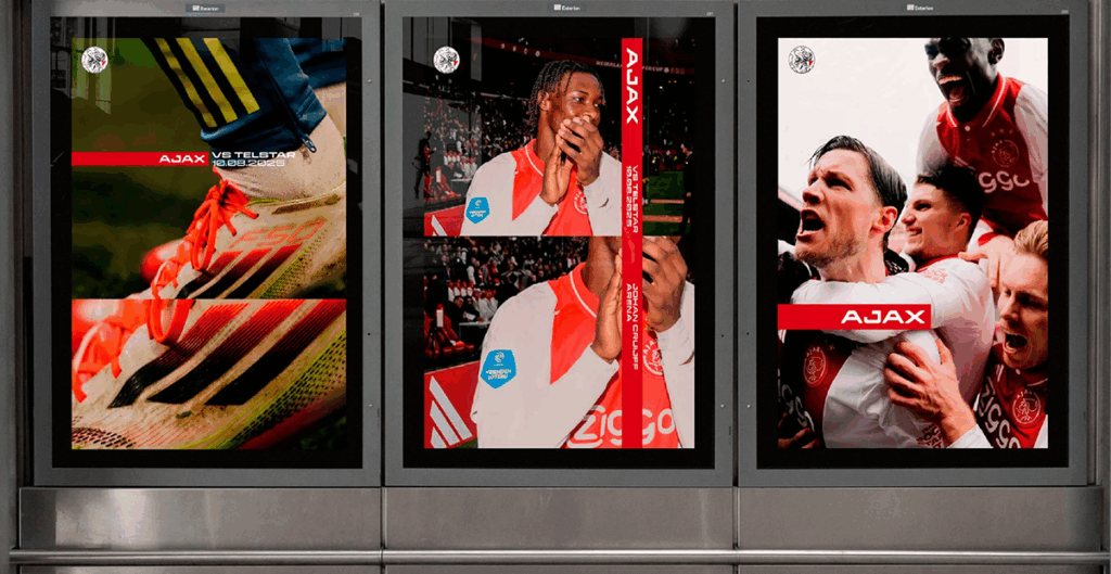
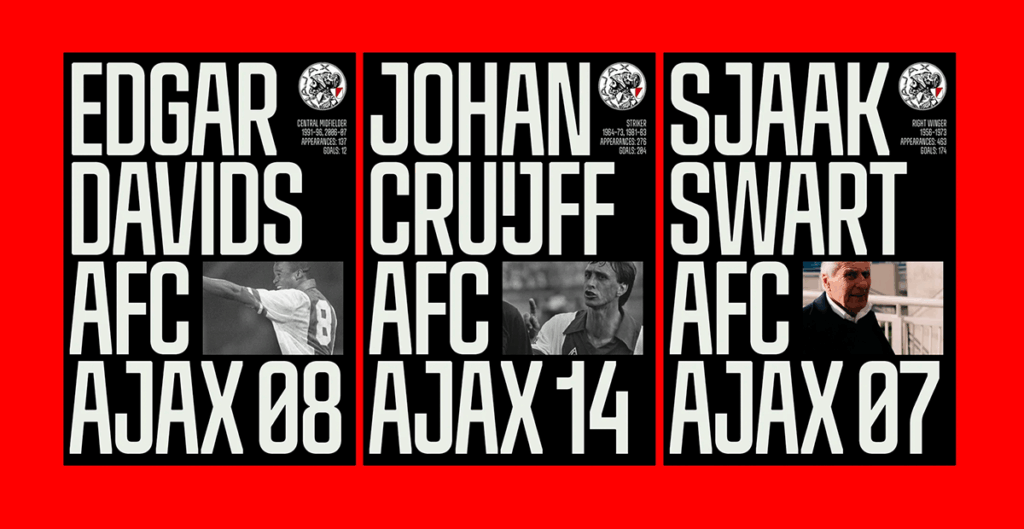
For its 125th anniversary, AFC Ajax partnered with Amsterdam studio Smörgåsbord to reimagine its identity. Rather than inventing something new, the team dug into archives, bar memorabilia, and the city’s own design DNA to create a visual system that frames Ajax’s classic logo without touching it. A new custom font family, an editorial logotype, and a richer colour system bring flexibility across stadium, broadcast, and lifestyle touchpoints—without diluting the club’s historic core.
Ajax’s rebrand isn’t about nostalgia. It’s about showing that heritage can be a future-facing growth engine when treated with cultural sensitivity and design craft. In an era when sports brands increasingly compete in lifestyle arenas, Ajax is proving that authenticity beats imitation—and that the past can power the future.
Our takeaways
Guard the untouchables. Ajax’s classic crest wasn’t redesigned—it was recontextualised. Sometimes the best move is to design around an icon, not over it.
Heritage as a growth platform. This rebrand doesn’t freeze history—it translates it across stadium, screen, and lifestyle, giving Ajax permission to stretch.
Culture first, category second. By rejecting football’s design clichés, Ajax positioned itself less as a club and more as a cultural institution—making lifestyle relevance feel earned, not borrowed.